New York Arts Magazine,
Review from ArtLies:
Erwin Redl: Fade IV Conduit Gallery
Matthew Bourbon
All art embodies an argument for its own efficacy. In fact, art acts upon the world much like an advertisement or a model for its own version of value and taste. Because of this inherent sense of self- promotion, every work of art sets up certain expectations and parameters for the examination of its particulars. For instance, we do not look the same way at a pale and sinister Luc Tuymans painting as we do the organized whirlwind of detritus in a Sarah Sze installation. Every artist asks us to think and examine the qualities of their art in a different fashion. We are led to interpret what we see with uniquely separate rules of engagement.
A recent LED installation by Erwin Redl at Conduit Gallery is no exception. What Redl asks of us with his elegant wall of lights is delimited by his obvious desire to affect our senses. Redl systematically covered every inch of Conduit's largest gallery wall with delicate, tiny lights separated from each other by a few inches. Creating a grid on the wall strung with wire, an intense field of red light waxes and wanes; the left side of the lighted wall fades while the right side shines brightly and vice versa. Controlling the modulation of light with a computer program, Redl manufactures a system of perpetual repetition. This constant fluctuation envelopes us in a task of detailed observation, dooming us to an unfulfilled, Sisyphus-like experience. There's no denouement to this artwork just ebb and flow, ebb and flow.
Interestingly, if one examines the oscillating light carefully, the methodical movement begins to mesmerize one's attentive gaze. I suppose anything can be used to focus upon for meditation, but there is something about Redl's work that lends itself to a specifically meditative stance. I think it is because he combines a decidedly retinal experience with an encounter that places us in our bodies. For all its technological flare, Redl's modulating red lights are almost guttural and base. His work is akin to watching the subtle, licking flames of a fire; one can easily get lost in the nuances of perception. Rhythm, periodicity and luminescence are clearly the artist's forte.
Because Redl tries to reduce our interpretive concerns to the notation of our sensations, he forces us, by default, to register how his shimmering installation affects our bodies. It's as if after extended looking, we need to recalibrate our senses to our form. Of course, such experiences are only available to those willing to spend time slowly examining the lights and their influence over the viewer: either you're in the mood or you're not.
Erwin Redl, Fade IV, 2006 Computer-controlled LED installation 37 feet 5 inches x 42 feet 10 inches Photos by Allison V. Smith
Irony, however, does exist in Redl's slightly rarified field of perception and glaring lights. Despite its visual rigor, the LED installation can't help but refer to the neon lights of commercial advertising, calling our attention to buy Coke or Eat at Joe's. Further, one is led to think of the ridiculously absurd spectacles of, say, Christmas decorations where the more glaring the display the better. Of course, I do not mean to imply that Redl's installation is some socialized form of crass commercialism. Rather, I mean to suggest that the use of light to seduce is powerfully programmed into our DNA. We react instinctually to such displays. In all its cliché, light denotes health and vibrancy. It draws us in, offering warmth and comfort. We seek light for its contrast to the void associated with its absence. (Think of all those supposed near- death descriptions people prattle on about as they're interviewed on questionable television programs. What do they see in their last moment? Glowing light.)
The fact that Redl traffics in an easy, perhaps manipulative mode of seduction doesn't discount the agency of his art. His work might be criticized as shallowly entertaining in its garish insistence for our attention, but it is also physically intriguing in its repetitive gradients of lucent color. Redl's installation traps us in its computer-controlled mechanisms and then leaves us without resolution. We are pushed back upon ourselves, asked to examine our relationship to this wall of light. This proves to be both the work's discomfort and its strength.
Review from FlashArt:
The New Five Foot Shelf
Texas Gallery, Houston Texas
Dates: April 28-May 28, 2005
“Honey, I rearranged the collection or should I say reconfigured or recontextualized or rewrote our cultural products.”
So states one entry from Allen Ruppersberg’s replica of the 1910 Harvard Classics “Dr. Eliot’s Five Foot Shelf of Books.” Within Ruppersberg’s carefully reproduced volumes, he rewrites his childhood encyclopedia of knowledge and literature as a means to document his own ruminations on language, meaning and the nature of mind. Sitting upon a large wooden table the fifty books lean against each other in their original numerical order, though in complete disarray according to Ruppersberg’s invented numbering system. Inside the books there are distinct typefaces, which reflect different storylines. Comical remarks are situated near philosophical commentary and mundane anecdotes. Half way through each book the pages bleed to white. Among these empty pages, Ruppersberg places an occasional obituary he has cut from a newspaper. These listings, of mostly artists, act as monuments to individuals who constructed their own path toward defining a personal sense of meaning.
Accompanying Ruppersberg’s diaristic lexicon is a series of 44 posters depicting his New York studio. The true to life scale of the images reveal the studio space as a site filled with various collections, orchestrated among the minutia of Ruppersberg’s everyday life. While appearing to faithfully record the contents of a room—upon examination—the relationship between objects feels carefully contrived. It’s as if Ruppersberg has crafted a diorama containing hundreds of miniature still life depictions. One is invited to play a mental game of connect the dots with the cultural products displayed. Ruppersberg seems to be suggesting that our search for meaning is inevitable, given our foreignness to one another and our inexorable entanglement with our given culture. In this sense, his work is a kind of self-portrait masquerading as an intellectual puzzle. Essentially, The New Five Foot Shelf is a multi-faceted attempt at understanding how we create and inhabit an idiosyncratic relationship with everything outside our own person.
Review from FlashArt:
Review of Susie Rosmarin
Angstrom Gallery, Dallas Texas
Dates: May 29-July 26, 2003
Susie Rosmarin makes art that hurts. Taking up where Op art left off, Rosmarin’s paintings are tightly orchestrated geometries composed of small repeated lines. Like many of her Op art predecessors, Rosmarin’s precision markings are woven into gyrating rhythms that are often nauseating. Her paintings are covered with hard-edged patterns that first seduce and then slowly blur, causing a kind of motion sickness. What makes Rosmarin more than a mere pattern painter, however, is her attention to the nuance of mathematical spacing. Her adherence to exact measurements and carefully crafted rules of engagement expose a fundamental desire to control sensation. Essentially, Rosmarin’s paintings are geared toward creating a powerfully tailored physical response. Even when she suggests narrative associations, as she does with some of her titles, sensation always remains paramount.
In her black and white paintings, Rosmarin examines the intricacies of the fabric pattern gingham. Interestingly, the overlapping lines she renders in these works seem less like pigment, and more like transparent tape laced over the surface of black canvas. Rosmarin’s technique in these works is fastidious to the extreme. Delicately thatched lines are fixed in place—yet the grid structure that Rosmarin builds shimmers in a kind of restrained oscillation. Even if Rosmarin seems excessively fixated by visual pyrotechnics, her domineering craft always remains convincing in its steadfast resolve.
Fortunately, when Rosmarin chooses to use color, the full complexity and, perhaps inevitable chaos, of her designs emerges. In a large painting like Red Fog the undulating chromatic lines feel like they’re coursing with energy. Ironically, for an art that foregrounds color, line and pattern this electrically charged painting is most interesting in its pictorial depth. The disco ball reflections and saturated hues fluctuate with movement, revealing hidden nooks and recessed hollows. Working to further exploit these surprising spatial anomalies seems a worthwhile direction for Rosmarin, if she is to stretch beyond the confines of her adopted genre.
Review from Artforum Online:
Robert Smithson
DALLAS MUSEUM OF ART
1717 North Harwood
November 24–April 24
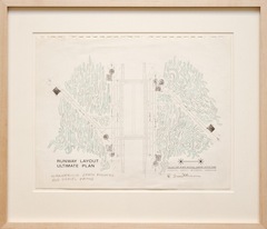
Robert Smithson, Dallas-Fort Worth Regional Airport Layout Plan: Wandering Earth Mounds and Gravel Paths, 1966, pencil, crayon, paper, 11 x 14”.
Few artists are as universally known for a single work of art as Robert Smithson is for Spiral Jetty, 1970. Yet this art-historical hallmark wouldn’t have existed had Smithson not been commissioned to create a site-specific installation for the Dallas-Fort Worth Airport in 1966. With this project at hand, Smithson was inspired to imagine flying in airplanes as the primary vantage to see his proposed sculptural experiments, proving a key turning point in the artist’s conception of monumental works executed with and in the landscape. Except for the posthumously constructedAmarillo Ramp, 1973, this small exhibition pays homage to five of the artist’s unrealized artworks in various locales around Texas.
Earth Window, 1966, which was designed as several horizontal square holes excavated and filled with baseball-stadium lights, then covered with crushed glass, would have glittered like a disco ball radiating from the earth. Dallas‐Fort Worth Regional Airport Layout Plan: Wandering Earth Mounds and Gravel Paths, 1966, which as the title suggests is carefully arranged dirt mounds and rock trails, appears as meandering burial mounds. With Island of Sulfur (Dollar Bay), 1970, Smithson envisioned a dramatic film project documenting numerous dump trucks moving boulders of sulfur from a quarry to a barge, finally to deposit their neon yellow loads, overwhelming the small Dollar Bay Island.
In its totality, Smithson’s work embodies a kind of hubris, not unlike the ancient desire to be monumentalized via ostentatious architectural edifices. The difference between the Egyptian pyramids, for instance, and Smithson’s proposals is the intended audience. Smithson understood art as an active force in the world that can alter the substance and comprehension of human situations, place, and possibilities. Not surprisingly, the mood of this exhibition is reverently melancholy; one can’t help but feel the divide between the hastily drawn plans on various sheets of paper and the heroic vision they were ultimately meant to become.
— Matthew Bourbon